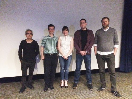
DePaul’s Visiting Designer Series hosted “Talk: Text + Type,” established typeface designer, Tobias Frere-Jones Thursday evening.
Frere-Jones is an award-winning typeface designer, Yale professor and founder and design director of Frere-Jones Type Foundry. He has created some of the most widely used typefaces, a few of which include Archer, Gotham, Interstate, Mallory, Poynter Oldstyle, Retina, Tungsten and Whitney.
DePaul graphic design professor Heather Quinn started the evening off with a story from her early design years when she first reached out to Frere-Jones on the hunt for Martha Stewart’s unique typeface. Although this font wasn’t available for purchase, Quinn’s respect for Frere-Jones’ “timeless, engaging and thoughtful” work grew and their professional relationship continued.
Frere-Jones began his talk by confessing the questions that used to bug him most as a typeface designer: why make more typefaces? Aren’t there enough already? His response: “I like problems and type design is full of them.” Instead of taking offense, Frere-Jones began to see it as a way to explain what he does as a typeface designer, something your average fashion designer or architect wouldn’t normally be confronted with.
Solving modern problems in communication is a lot of what occupies Frere-Jones typographic design skills. “Talk: Text + Type” elaborated on two modern issues dominating the world of typographic design that many of us experience but may not be aware of.

One of these problems you may be experiencing right now if you’re reading this article on a desktop or mobile. This is the way text is displayed and rendered on our screens. Often times, pixels don’t correctly portray the intended size, spacing or features of lettering making the type significantly harder for our eyes to decipher between letters and efficiently read. His solution? Retina.
A second problem is creating typefaces in different languages that are accessible and just as optical. Hard drive capabilities and storage is no longer a factor in how many languages a typeface can include on our computers. The challenge here being where to start, what languages are used most and how long it will it take to create ideal typefaces for each.
“I began working on Vietnamese (first) because, as it turns out, more people speak this over Italian,” Frere-Jones said.
The event concluded in an insightful Q&A with DePaul’s faculty, students and aspiring graphic designers.
Frere-Jones ended the conversation with a light suggestion of using say, any typeface other than Gotham, one of his typefaces that has absolutely exploded since its debut in 2000.
