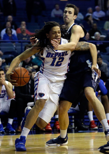
In the intense weeks and cutthroat journey to the NCAA championship, the colleges are not only given the opportunity to prove their talent of the sport, but the fans themselves are given the chance to prove their loyalty and support to their team.
From face paint to digging out their college basketball jersey from the closet, fans show their support by blasting the colors of the jerseys their college team represents.
It’s these colors that ultimately separate each team from one another — besides their respected college name. The color of the stich on their jerseys means just as much as what the stich spells as well. Dark blue and gold holds no other bounds than to Notre Dame. The same could be said in of the dark green and white of Michigan State, or the blue and Carolina white behind North Carolina’s kit.
So where do the colors of DePaul’s men’s basketball’s jerseys stand with students and fans alike? For DePaul student, Billy Fezzuoglio, the DePaul basketball jerseys are some of his favorite in the sport.
“I think the jerseys are dope. I mean I don’t think our colors are anything special. Red, blue, and white are pretty common colors you see nowadays on teams, but I still think they’re better than other colleges,” Fezzuglio said, who noted that he attends the games at Allstate Arena quite regularly. “I’d say my favorite would be the white jerseys, they’re the only ones I really see — being that they are the home jerseys.”
“But I do wish I got to see their away and alternate jerseys more because those are pretty unique in a way, I guess.”
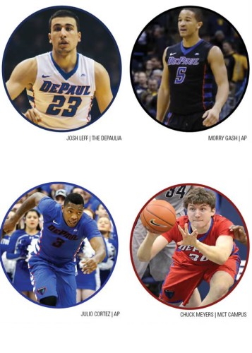
Whether the away and alternate jerseys are unique or not is a matter of opinion, but there is one undeniable fact, a lot of students have a lot of opinions and critiques on each jersey. From the white and blue home jerseys to the different blue and black away jerseys, and on the rare occasion, even the red alternate jerseys — after viewing pictures of each jersey, students have been quite vocal about which ones they favorite and which ones they dislike.
“I think the most unique jersey of them all would be the blue ones, with the black lettering and all — though I would definitely argue it’s hard to read the names and numbering from far away, given the dark color coordination of the black vs. the blue,” Fezzuglio said.
Other students and fans have voiced similar concerns, as well.
“I mean I’m not going to say it’s the biggest problem concerning our men’s basketball team, but I see where people are coming from,” DePaul alumnus Ryan Yester said. “The black lettering just doesn’t mesh together well with the blue jersey, the only thing that stands out is the white Nike symbol — why not just make the lettering white.”
Even DePaul men’s basketball forward, Peter Ryckbosch agrees the black lettering on the blue away jersey could be somewhat better.
“It makes sense. I’ve never been told by someone that they can’t read it but I understand that it could look a little strange from far away,” Ryckbosch said. “My favorite have to be the black away jerseys, they’re definitely the coolest.”
“But I do wish we played with the red ones more often, we rarely wear those at games.”
Though in the cloud of different opinions — from favorable to distasteful — regarding DePaul’s jerseys, one aspect ringed true with most students. They’re far from the ugliest in the NCAA.
“I like our jerseys a lot, our colors mesh really well together—I think the black with the red outline is awesome,” DePaul student Peter Eugenis said. “My least favorite is Baylor when they wear that highlighter yellow, I hate that jersey.”
Ryckbosch had his own distaste for some jersey of the teams he plays.
“You know we really don’t play any really ugly looking teams, it’s pretty tasteful,” Ryckbosch said. “I don’t like Notre Dames’ color though. It’s that poop brown and tan jersey.”
“I remember we played them two years ago in a tournament, and all I was thinking was, ‘Yikes what are you guys wearing?’”

Best dressed: Rating DePaul’s jerseys
White and blue: These home jerseys are DePaul’s best. They’re clean, simple and a great color scheme.
Black and blue: Not bad. The blue is a little hard to read, but the black is swift. Definitely the best away option.
Blue and black: These are absolutely horrendous. The black font is unreadable. They not to change it to white ASAP.
Red: Red’s not really my thing, but these are still nice. The blue stripes mesh well with the jersey.

