Chicago Fire looks to make amends with rebrand
Chicago Fire Instagram for The DePaulia
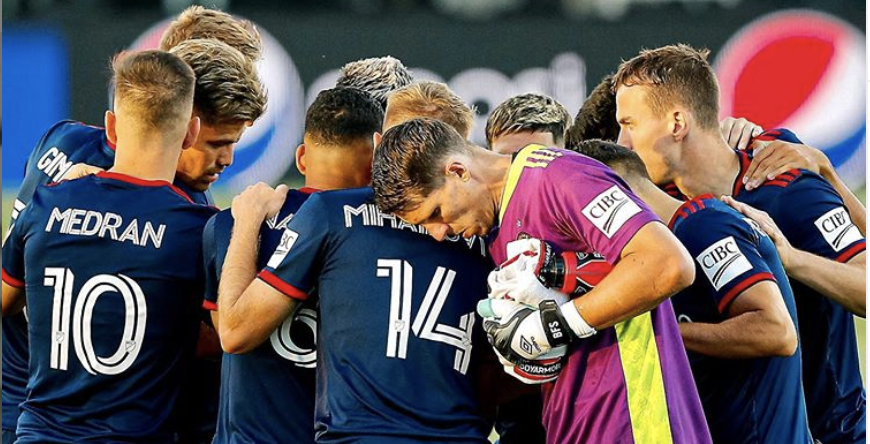
El equipo de los Chicago Fire se unen antes de un juego en agosto.
As the old saying goes, “if at first you don’t succeed, try, try, try again.”
The Chicago Fire are doing just that and for the second time in as many years, they are going ahead with another rebrand of the team.
The club’s first rebrand included a name change to the “Chicago Fire Soccer Club,” a change to the team’s color scheme and a new team crest. The latter, dubbed the “Fire Crown” logo, was panned heavily by the fans as it had very few tie-ins with the team or the city.
“I thought the first rebrand was necessary to drive up interest when moving back to the city and show that we are trying to move forward,” said Jaime Nambo, a Fire supporter. “However, they completely dropped the ball. I did not like the new crest. It’s abstract and hardly tells Chicago’s story. I would like to see a more traditional soccer crest that really incorporates Chicago’s history.”
The Fire announced their rebrand on Twitter, and this time around, it seems like the organization has learned from past mistakes, as they will be taking fan input when it comes to the design process.
“Part of the reason for doing this [rebrand] is to engage fans so they feel stronger about the team,” said Andy Clark, director of the sports management program at DePaul University. “By incorporating fan feedback, then it makes their most avid fans feel more part of the process and more invested in the team.”
Let’s collab, Chicago.
? https://t.co/qP1KEZS2v1 pic.twitter.com/HHM4lqPC7y
— Chicago Fire FC (@ChicagoFire) January 8, 2021
Per their release, as part of celebrating their 25th anniversary in 2022, the new kits will bear the new crest — “one that reflects the spirit of both Chicago Fire FC and the city we call home.”
What this means is that for 2021, the team will still be featuring the old crown logo — a logo that fans were so dissatisfied with that even owner Joe Mansueto noticed.
“Exactly one year ago today, I told our fans if the existing badge wasn’t working for them that we’d fix it — and that’s what we’re going to do,” Mansueto said in a club statement. “Fans have made their voices heard over the past year and now we’ll undergo a fan-focused process to create an identity that will stand for all Chicago for decades to come.”
There is optimism behind this latest rebrand attempt. The club is set to collaborate with graphic designer and art specialist Matt Wolff. Wolff has been responsible for a number of Major League Soccer club logos, such as New York City FC and Los Angeles FC, as well as FC Tulsa of the United Soccer League.
“It’s always a catch-22 between having a designer develop something, that’s what they do for a living and they’re professional, to also incorporate impact from fans and what they feel,” Clark said. “Fans, owners, employees often have their own ideas but it doesn’t always match with creating a mark that is going to make an impact on hundreds of things. It’s not an easy thing to do. It’s T-shirts and hats, uniforms, signage, cloud material and websites.”
The Fire have partnered with Chicago-based firms Studio/lab and rEvolution, a brand and design consulting firm and sports marketing agency, respectively. They also partnered with the Stand for Chicago Council, who will ensure that “the project gives a voice to the diverse people of the city.”
The process seems to be off to a strong start,l with the Fire providing an update that they’ve received more than 1,000 fan submissions and met with members of the Supports Council to lay out their project and answer any questions.
Just the beginning.
Thank you to everyone who has shared their voice in these first 7 days.
Week 1 updates ?
— Chicago Fire FC (@ChicagoFire) January 15, 2021
It is imperative the Fire get this second rebrand right. It is unusual for a club to go through a rebrand again in such a short amount of time, especially given that the first one was a marker of sorts, with the team moving back to Chicago from Bridgeview.
Aside from success on the field, the Fire are looking for relevance. They are still not on the minds of a number of sports fans. They know they need to change that, considering the amount of people in Chicago who have a passion for soccer. An identifiable crest can go a long way towards achieving that. At the same time, the Fire know they cannot please everyone.
“I think as long as it’s a more traditional football design, with clear elements that show Chicago’s history, most people will accept it over time,” Nambo said.





sean stone / May 11, 2021 at 8:23 am
Strange that the Red Stars were able to nail it on the first attempt.
Yet the Fire continues to step on rakes.
Sean / May 11, 2021 at 8:22 am
Weird that the Chicago Red Stars nailed it on the first try, and the fire keeps stepping on rakes.
Buffalo Bro / Jan 25, 2021 at 9:23 am
Logo development like this, is really an extension of community supported public art. This is where the artist(s) listen first to the community. The development of a meaningful logo, for all of the city, will only happen when interested fans and the artists are in dialogue….throughout the logo design process. No dialogue, abject failure will result, again.