On Thursday, the newly relocated Los Angeles Chargers released their new logo, and the DePaulia design team had some thoughts about it. Here’s asst. design editor Leah Davis’ critiques of some bad sports logos.
![]() Los Angeles Chargers
Los Angeles Chargers
The Los Angeles Chargers football team, shortly after moving from San Diego to LA, announced their new logo a few days ago and from a designer’s perspective – it’s garbage. This design looks like a bulky, Arial-esque font was italicized and a slightly offset triangle was placed to make it look like a lightning bolt.
It’s too reminiscent of the Tampa Bay Lightning hockey team’s logo, which is a simple lightning bolt within a circle. The team’s Twitter account posted a tweet after the logo was released commenting on how similar the two looked using comedy,
“*checks mentions*, *squints*, *clears throat*, for the record, us and @dodgers are just friends.” The only writing on here is the city, is this the Dodgers or Chargers?
A fellow graphic designer, Lauren Johnson, observed something while looking at the logo,
“It looks like the Zenith logo off my grandma’s old TV from the ’80s,” she said.
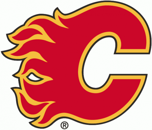 Calgary Flames
Looking at this logo for the first time, I have no idea what to think.
I don’t typically follow hockey but I would have no earthly idea which sport this team was from simply because it gives no context in its design. I would probably guess NASCAR racing if I’m being honest purely based on the flames.
“It looks like a hot sauce logo more than a hockey team logo, and I knew what the logo was,” Johnson said.
This is the logo for the Calgary Flames hockey team. I was disappointed to find out this was a hockey logo and not in fact, one for NASCAR racing.
Who hears hockey team based in Canada and automatically thinks ‘I’ve got it, let’s do flames!’? Maybe they carve up the ice to the point where it melts?
Who knows.
The colors are reminiscent of flames, which is fitting to their name. “’Eww’ is all I have to say. They should have chosen a different font,” Jacquelin Lin said.
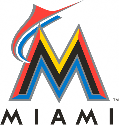 Miami Marlins
I had no idea the Miami Marlin’s baseball team updated their logo until I just Googled it five minutes ago.
I could’ve sworn this was the Maroon 5 “Moves Like Jagger” single release album cover (Trust me, look it up. You’ll see how similar it is). As far as the design goes, it’s not terrible.
The Marlin coming out of the “M” is extremely geometric and doesn’t look much like a Marlin at all except for its long bill on the front of its face that’s clearly visible.
In my opinion, that yellow part of the “M” should have been white and not yellow so it could have matched the Marlin coming out of it.
Also, Miami got rid of its well-known teal color for its logo and opted for a darker blue color along with red.
“I preferred the old logo. It just looked better in my opinion. It actually made sense with the team,” Johnson said.
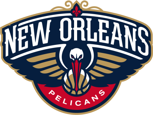 New Orleans Pelicans
The New Orleans Pelicans basketball team has a slightly less awful logo. Upon looking at this the first time, the colors all blended together nicely, the font chosen was appropriate for “New Orleans” and the logo itself is well put together.
Then I got to the Pelican. Is this pelican carrying a basketball in its beak? Or is the basketball its body? Am I looking at a rare basketball pelican? Now that I’ve seen the basketball beneath the pelican’s head and outspread wings as its body, I can’t un-see it. The “Pelicans” circle beneath the logo throws it off balance and it doesn’t need to be there. It’s too heavily red and the font used on the name. “Pelicans” isn’t even the same font they used for “New Orleans”. It should be removed altogether as the drawn pelican makes the team name very clear.
“It’s just really ugly. The colors aren’t nice and the logo looks more like it belongs outside a bar rather than representing a sports team,” Johnson said.
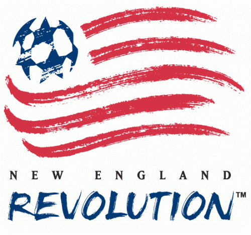 New England Revolution
This logo I actually kind of like. It’s different than most sports logos, however, like some American teams it screams “America” with its flag pattern and colors. That circle that makes up the blue starry part of the flag is indeed round however it doesn’t look like a soccer ball at all.
The kerning on “New England” is a little intense but at least it’s equally spaced. It should reach the edges of “Revolution” but those are nitpicky things my designer mind sees. “The stripes kind of look like blood,” Lauren Johnson said.
I agree, they remind me a lot of when someone cleats someone else’s leg and they’re bleeding. “I’m not really a fan of the texture,” Lin said.
The stripes also look like what you would see if you could visibly see the air movement around a ball flying through the air.
Overall, the logo isn’t that bad and out of this group of five it’s probably one of the better ones.